PyXplor Tutorial
Introduction
Welcome to the pyxplor package tutorial! This tutorial aims to showcase the ease and efficiency of using pyxplor for exploratory data analysis (EDA).
EDA serves as the cornerstone of understanding, interpreting, and ultimately deriving meaningful insights from data. It empowers data scientists and analysts (or anyone really who is exploring data) to unveil patterns, detect anomalies, and formulate hypotheses, laying the groundwork for robust modeling and informed decision-making. Not only is EDA key in gaining a deeper comprehension of the underlying phenomena but also guides the selection of appropriate techniques for subsequent analysis and allows us to focus our efforts on the most promising avenues of inquiry,making it an crucial precursor to effective data-driven strategies.
By the end of this guide, you’ll discover how this package can significantly streamline your EDA process by providing a suite of tools and functions designed specifically for data exploration tasks. This saves time and effort, allowing you to focus on interpreting insights rather than implementing basic analysis functionalities from scratch - making it a valuable tool for data exploration.
What to Expect
Learn how to harness the power of
pyxplorto simplify and expedite your EDA tasks.Gain insights into its essential functions that cater to various aspects of exploratory analysis.
Benefits of Using pyxplor
Simplifies complex EDA workflows.
Enhances data visualization for better interpretation.
Accelerates the EDA process with efficient functions.
Let’s dive in by importing the key functions from the pyxplor package, alongside other essential packages for this tutorial.
import pyxplor
from pyxplor.plot_binary import plot_binary
from pyxplor.plot_categorical import plot_categorical
from pyxplor.plot_numeric import plot_numeric
from pyxplor.plot_time_series import plot_time_series

import seaborn as sns
import pandas as pd
import os
pd.options.display.max_columns = 6
print(pyxplor.__version__)
2.0.11
Exploring seaborn taxis Dataset
We’ll be using the seaborn taxis dataset as our example dataset. This dataset, commonly employed in data science tutorials, contains information related to taxi rides and serves as an ideal playground for our exploration with pyxplor. With over a million recorded taxi journeys, this dataset offers a practical playground for learners and more experienced analysts alike to delve into exploratory data analysis (EDA) with pyxplor. With its diverse variables and sizable sample size, the taxis dataset facilitates guided exercises in uncovering insights, and even detecting anomalies and formulating hypotheses should you wish to expand on the content covered in this tutorial.
Let’s take a quick peek at the first couple of rows as well as the data type of each variable to get a sense of the data structure:
taxi = sns.load_dataset("taxis")
taxi.head()
| pickup | dropoff | passengers | ... | dropoff_zone | pickup_borough | dropoff_borough | |
|---|---|---|---|---|---|---|---|
| 0 | 2019-03-23 20:21:09 | 2019-03-23 20:27:24 | 1 | ... | UN/Turtle Bay South | Manhattan | Manhattan |
| 1 | 2019-03-04 16:11:55 | 2019-03-04 16:19:00 | 1 | ... | Upper West Side South | Manhattan | Manhattan |
| 2 | 2019-03-27 17:53:01 | 2019-03-27 18:00:25 | 1 | ... | West Village | Manhattan | Manhattan |
| 3 | 2019-03-10 01:23:59 | 2019-03-10 01:49:51 | 1 | ... | Yorkville West | Manhattan | Manhattan |
| 4 | 2019-03-30 13:27:42 | 2019-03-30 13:37:14 | 3 | ... | Yorkville West | Manhattan | Manhattan |
5 rows × 14 columns
print("Dataset Information:")
taxi.info()
Dataset Information:
<class 'pandas.core.frame.DataFrame'>
RangeIndex: 6433 entries, 0 to 6432
Data columns (total 14 columns):
 #   Column           Non-Null Count  Dtype
---  ------           --------------  -----
 0   pickup           6433 non-null   datetime64[ns]
 1   dropoff          6433 non-null   datetime64[ns]
 2   passengers       6433 non-null   int64
 3   distance         6433 non-null   float64
 4   fare             6433 non-null   float64
 5   tip              6433 non-null   float64
 6   tolls            6433 non-null   float64
 7   total            6433 non-null   float64
 8   color            6433 non-null   object
 9   payment          6389 non-null   object
 10  pickup_zone      6407 non-null   object
 11  dropoff_zone     6388 non-null   object
 12  pickup_borough   6407 non-null   object
 13  dropoff_borough  6388 non-null   object
dtypes: datetime64[ns](2), float64(5), int64(1), object(6)
memory usage: 703.7+ KB
Our taxis dataset is rich and diverse, featuring various data types, from numerical to datetime. Visualizing each variable individually in the taxis dataset might seem cumbersome, considering the mix of data types. Enter pyxplor—your solution to simplifying this intricate task. pyxplor offers a comprehensive suite of specialized plotting functions tailored to different data types. Whether you’re working with numeric, categorical, binary, or time series data, pyxplor streamlines the visualization process. Say goodbye to the hassle of creating different visualizations for each variable—pyxplor has got you covered!
Exploring Binary Features
We’ll start by exploring the binary features in our dataset. In our dataset, we have two binary features, color and payment. If we want to explore and visualize the distribution of these two binary variables, we can utilize the plot_binary function.
taxi.color.value_counts()
color
yellow    5451
green      982
Name: count, dtype: int64
taxi.payment.value_counts()
payment
credit card    4577
cash           1812
Name: count, dtype: int64
The current dataset contains null values, so we’ll have to drop them first before we apply the plot_binary function. This will be updated in a future version as we continue to optimize these functions.
taxi = taxi.dropna()
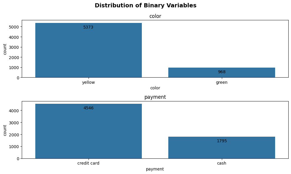
Count Plots
Now, that we’ve dropped our null values, we can apply our plot_binary function. This function is really simple to use. All the function requires is the dataframe (where the binary variables locate), a list of the binary variables and the plot type (count or pie). Here’s an example.
plot_binary(taxi, ['color', 'payment'], 'count')
(<Figure size 1000x600 with 2 Axes>,
 array([<Axes: title={'center': 'color'}, xlabel='count', ylabel='color'>,
        <Axes: title={'center': 'payment'}, xlabel='count', ylabel='payment'>],
       dtype=object))
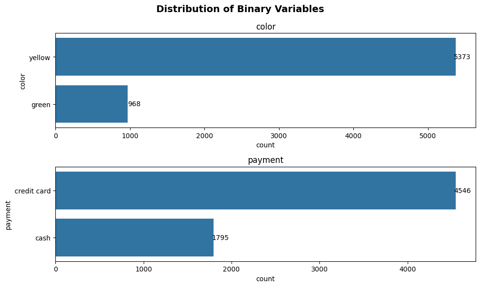
Ta da! We can see that the function automatically returns the visualization of all of the binary variables specified. The function also adds the labels to the bars automatically, which is a hassle to do in matplotlib.
Pie Charts
If you prefer visualizing these variables in pie charts. Just change the parameter of argument plot_kind from count to pie.
plot_binary(taxi, ['color', 'payment'], 'pie')
(<Figure size 1000x600 with 2 Axes>,
 array([<Axes: title={'center': 'Distribution of color'}>,
        <Axes: title={'center': 'Distribution of payment'}>], dtype=object))
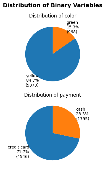
Wow! Would you look at that! Now we can even see the percentage of the distribution. Easy right! Next, we’ll explore the optional arguments that will allow you to configure your visualization.
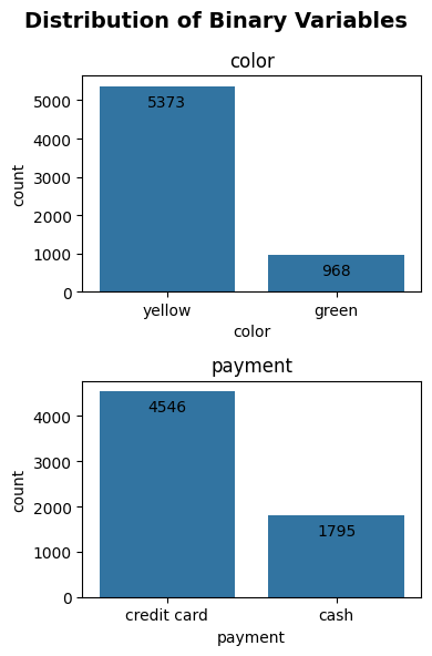
Optional Arguments
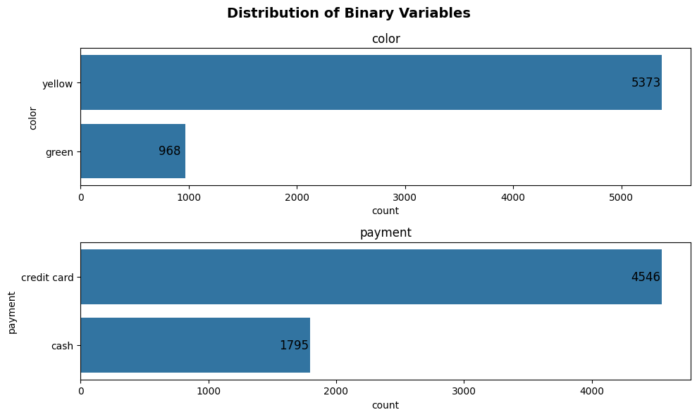
label_offset and label_fontsize
The first thing you’re allowed to configure is the location and the fontsize of the labels. This is so that you will be allowed to place the labels in a location that you prefer.
plot_binary(taxi, ['color', 'payment'], 'count', label_offset = 15, label_fontsize = 12)
(<Figure size 1000x600 with 2 Axes>,
 array([<Axes: title={'center': 'color'}, xlabel='count', ylabel='color'>,
        <Axes: title={'center': 'payment'}, xlabel='count', ylabel='payment'>],
       dtype=object))

Since the default plot orientation (can be modified through argument plot_orientation) is horizontal (the bars are horizontal), label_offset moves the label to the right if it’s positive and moves the label to the left if the it’s negative.
plot_binary(taxi, ['color', 'payment'], 'count', label_offset = -16, label_fontsize = 12)
(<Figure size 1000x600 with 2 Axes>,
 array([<Axes: title={'center': 'color'}, xlabel='count', ylabel='color'>,
        <Axes: title={'center': 'payment'}, xlabel='count', ylabel='payment'>],
       dtype=object))
Note that label_offset and label_fontsize will only affect the bar chart. These arguments will not affect the labels of the pie chart. This will be a function that we’ll add in the future.
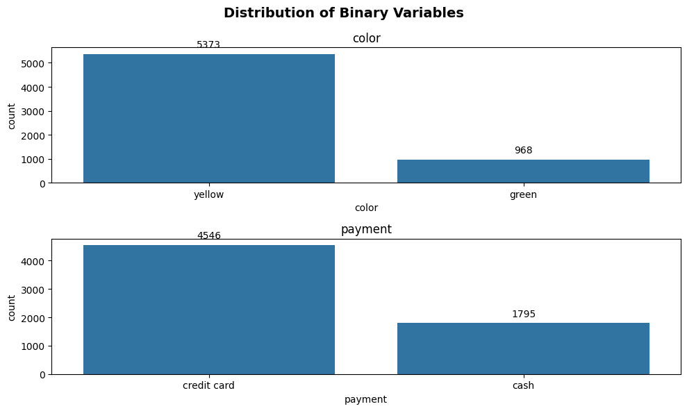
plot_orientation
Just now we mentioned that we can modify the plot_orinetation to change how the bars are oriented. plot_orientation takes on 2 values, h or v, which stands for horizontal-orientation and vertical-orientation, respectively. Note that this argument also only applies to the bar chart since there’s only one type of orientation for pie charts. Below is an example where we switch the default orientation from h to v.
plot_binary(taxi, ['color', 'payment'], 'count', plot_orientation='v')
(<Figure size 1000x600 with 2 Axes>,
 array([<Axes: title={'center': 'color'}, xlabel='color', ylabel='count'>,
        <Axes: title={'center': 'payment'}, xlabel='payment', ylabel='count'>],
       dtype=object))
As we change the orientation from h to v, the way label_offset works also changes. If we set the label_offset as a positive value, the labels will go up, whereas if label_offset is a negative value, the position will go down.
plot_binary(taxi, ['color', 'payment'], 'count', label_offset = -10, plot_orientation='v')
(<Figure size 1000x600 with 2 Axes>,
 array([<Axes: title={'center': 'color'}, xlabel='color', ylabel='count'>,
        <Axes: title={'center': 'payment'}, xlabel='payment', ylabel='count'>],
       dtype=object))
figsize
So you’ll notice that the plot above looks a bit compressed because of the figure shape. Don’t worry because you’ll be able to modify the figure shape with the argument figsize. The argument figsize takes in a tuple with two values. The first value is the width of your figure and the second value is the height of your figure. Below is an example as we modify the figsize so the plot becomes easier to visualize.
plot_binary(taxi, ['color', 'payment'], 'count', label_offset = -10, plot_orientation='v', figsize=(4, 6))
(<Figure size 400x600 with 2 Axes>,
 array([<Axes: title={'center': 'color'}, xlabel='color', ylabel='count'>,
        <Axes: title={'center': 'payment'}, xlabel='payment', ylabel='count'>],
       dtype=object))
The plot looks much better now that it’s not compressed! Hooray!
output
The next argument is output, where we can choose to download the figure for use. This argument takes in a boolean value. The default is False, which means that you do not want to download the figure. If you set it as True, then it will download the figure to your current path as binary_variables.png.
plot_binary(taxi, ['color', 'payment'], 'count', output=True)
(<Figure size 1000x600 with 2 Axes>,
 array([<Axes: title={'center': 'color'}, xlabel='count', ylabel='color'>,
        <Axes: title={'center': 'payment'}, xlabel='count', ylabel='payment'>],
       dtype=object))
If you run the code above, you should notice that the figure is downloaded to the current working directory. We’ll remove the figure to clean up the process.
os.remove("binary_variables.png")
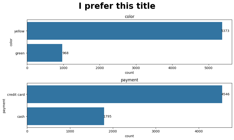
super_title and super_title_font
Finally, we can modify the super title and its fontsize. The default super title is Distribution of Binary Variables. If you have something that you prefer or if you want to change the fontsize of it, you’re more than welcome to modify it.
plot_binary(taxi, ['color', 'payment'], 'count', super_title='I prefer this title', super_title_font=25)
(<Figure size 1000x600 with 2 Axes>,
 array([<Axes: title={'center': 'color'}, xlabel='count', ylabel='color'>,
        <Axes: title={'center': 'payment'}, xlabel='count', ylabel='payment'>],
       dtype=object))
As we continue to work on optimizing this function, more flexibility in terms of configuring the appeareance of the plot will be added. Have fun and play around with this function!
Exploring Categorical Features
Next, we will explore the categorical features in our dataset using our plot_categorical function. Like our plot_binary function above, this function allows us to visualize the supplied categorical features as horizontal bar plots. We will explore plot_categorical’s functionality further through an example using the features in our taxi dataset.
Looking at our taxi dataset, we see that pickup_zone, dropoff_zone, pickup_borough, dropoff_borough all are nominal features.
len(taxi.pickup_zone.unique()), len(taxi.dropoff_zone.unique())
(194, 203)
We note above that pickup_zone and dropoff_zone have 194 and 203 unique categories, respectively.
len(taxi.pickup_borough.unique()), len(taxi.dropoff_borough.unique())
(4, 5)
However, pickup_borough and dropoff_borough are a higher-level of category and only have 4 and 5 unique categories, respectively.
We also note that, by nature of the number of passengers allowed in a car, passengers can also be considered a categorical feature. We see below that passengers has 7 unique values.
len(taxi.passengers.unique())
7
Now that we have done some preliminary exploration of our categorical features, we can apply the plot_categorical function. From the function definition, we note that the only required parameters are our input dataframe (that contains the categorical variables) and our list of categorical variables to be visualized.
Bar Plots
Let’s first walk through a simple example with one categorical variable - passengers.
plot_categorical(taxi, ['passengers'])
(<Figure size 1000x600 with 1 Axes>,
 <Axes: title={'center': 'passengers'}, xlabel='count'>)
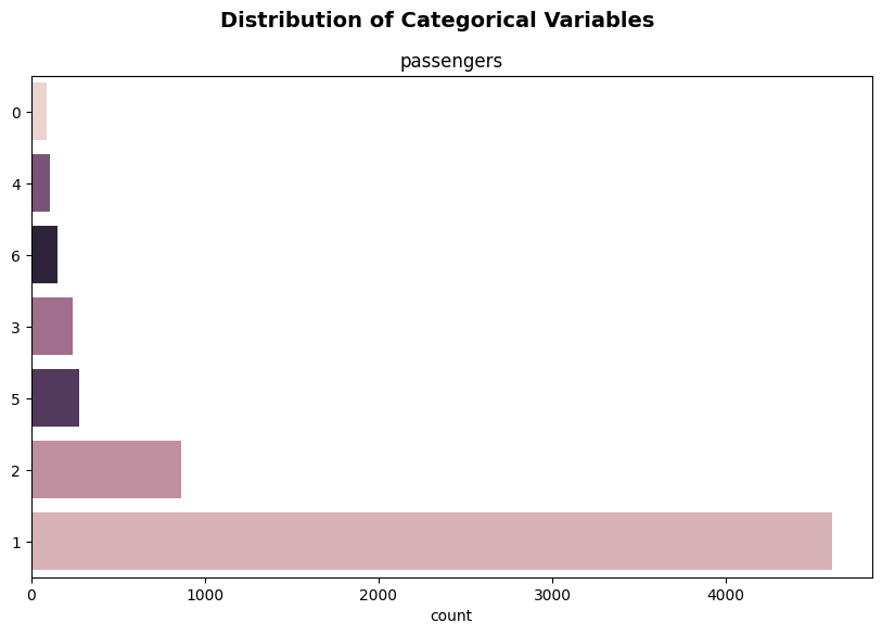
Although this is a very simple example with a list of just one categorical feature to plot, we can observe some of the plotting behaviour that our plot_categorical function automates without adding any of the optional parameters. The function creates a horizontal bar plot for the supplied categorical variables ordered in descending order of count from the x-axis upwards - and distinguishes these categories by color as well.
Now that we’ve seen the simplest example, let’s see what happens when we go to add all of the categorical features we noted above - pickup_zone, dropoff_zone, pickup_borough, dropoff_borough.
categorical_feats = ['passengers', 'pickup_zone', 'dropoff_zone', 'pickup_borough', 'dropoff_borough']

plot_categorical(taxi, categorical_feats)
Only displaying plots for categorical variables with 20 or less unique values.
Dropping the following variables for plotting: pickup_zone, dropoff_zone
(<Figure size 1000x600 with 4 Axes>,
 array([<Axes: title={'center': 'passengers'}, xlabel='count'>,
        <Axes: title={'center': 'pickup_borough'}, xlabel='count'>,
        <Axes: title={'center': 'dropoff_borough'}, xlabel='count'>,
        <Axes: >], dtype=object))
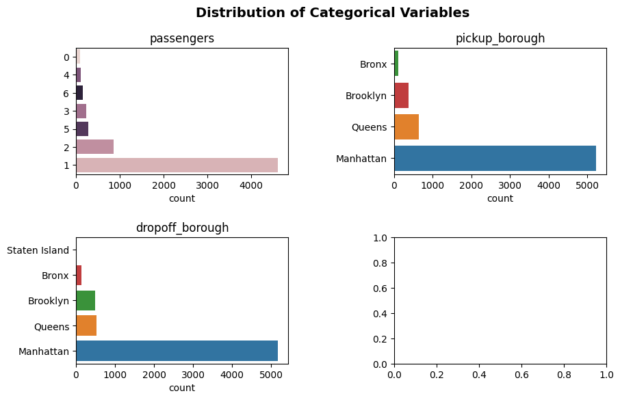
Interesting… you may be asking “Why did it only plot three of our categorical features? What happened to pickup_zone and dropoff_zone?”. The answer is that the plot_categorical function only plots those categorical variables specified in the list of variables that have 20 or less unique values. As we saw above, pickup_zone and dropoff_zone have far more unique values than that - 194 and 203, repsectively. Since visualizing that many values on a bar plot would be very crammed and therefore may warrant a separate EDA of its own, plot_categorical drops pickup_zone and dropoff_zone, and returns the following message to indicate that it has done so:
Only displaying plots for categorical variables with 20 or less unique values.
Dropping the following variables for plotting: pickup_zone, dropoff_zone
From this slightly more complex example, we can see that plot_categorical helps us with preliminary EDA for categorical features. We can even use the outputs of this function and go one step further, using the messages that the function returns (like the one above) to tell us which more complex categorical variables may require a more detailed analysis.
Now that we’ve got the hang of the basics of plot_categorical, let’s take a look at our optional parameters. Let’s see how you can configure your visualiziation and make it your own!
Optional Arguments
yaxis_label_fontsize
yaxis_label_fontsize allows us to configure the font size of the axis labels. The default font size is 10 pts - but that may be a bit small for some people. Let’s try increasing this to 15 to try and make our labels more readable!
plot_categorical(taxi, categorical_feats, yaxis_label_fontsize=15)
Only displaying plots for categorical variables with 20 or less unique values.
Dropping the following variables for plotting: pickup_zone, dropoff_zone
(<Figure size 1000x600 with 4 Axes>,
 array([<Axes: title={'center': 'passengers'}, xlabel='count'>,
        <Axes: title={'center': 'pickup_borough'}, xlabel='count'>,
        <Axes: title={'center': 'dropoff_borough'}, xlabel='count'>,
        <Axes: >], dtype=object))
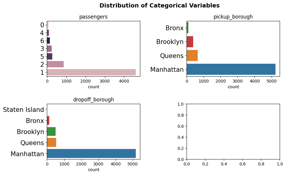
Nice! Now we don’t need our glasses to read the categories!
Take note also that the y-axis label font size configuration does not apply to our empty plot (which appears as we have an uneven number of sublots in our grid).
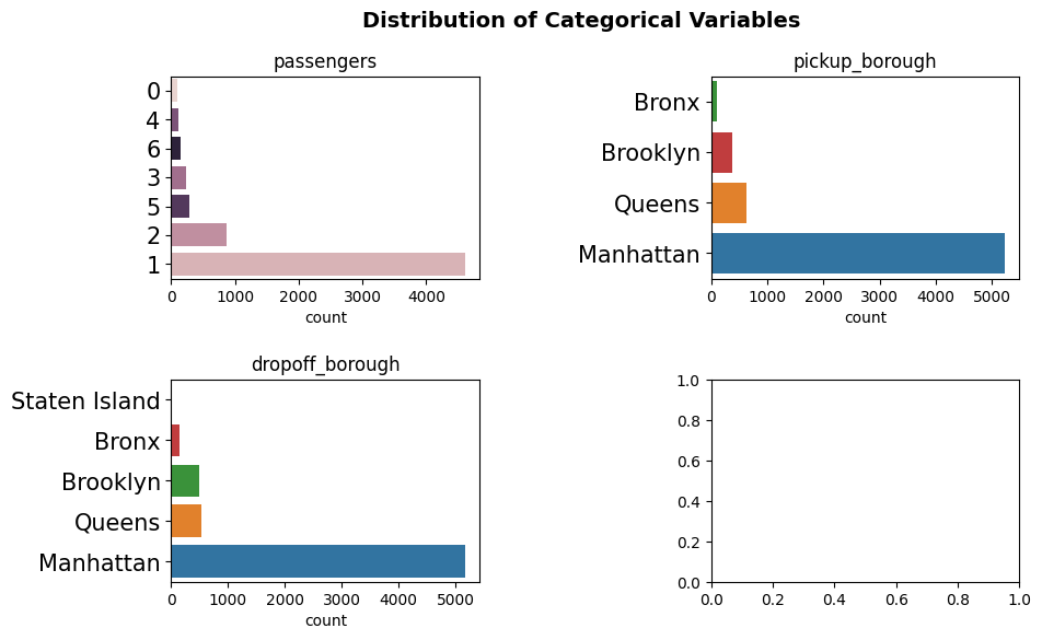
padding
We can use the padding parameter to increase or decrease the space between subplots (noting that the padding value is expressed as a fraction of the average Axes height). The padding parameter is a tuple of two numerical values - where the first element represents the height padding and the second represents the width padding.
Looking at our most recent figure, we see that after increasing the fontsize of our y-axis label, we now are running into the aesthetic problem that the beginning of our y-axis labels are very close to the edge of the subplot to it’s side. Let’s try increasing the width spacing to 0.75 (while keeping the height spacing at the default value of 0.5) to avoid any confusion with labeling.
plot_categorical(taxi, categorical_feats, yaxis_label_fontsize=15, padding=(0.5, 0.75))
Only displaying plots for categorical variables with 20 or less unique values.
Dropping the following variables for plotting: pickup_zone, dropoff_zone
(<Figure size 1000x600 with 4 Axes>,
 array([<Axes: title={'center': 'passengers'}, xlabel='count'>,
        <Axes: title={'center': 'pickup_borough'}, xlabel='count'>,
        <Axes: title={'center': 'dropoff_borough'}, xlabel='count'>,
        <Axes: >], dtype=object))
figsize
Like with plot_binary, we can modify the figure dimensions using the figsize parameter. figsize is a tuple of two numeric values - the width and height of the figure (with the default being a width of 10 and a height of 6).
Let’s go back to our default inputs for yaxis_label_fontsize and padding, but increasing the width to get more granular into the count scale!
plot_categorical(taxi, categorical_feats, figsize=(15, 6))
Only displaying plots for categorical variables with 20 or less unique values.
Dropping the following variables for plotting: pickup_zone, dropoff_zone
(<Figure size 1500x600 with 4 Axes>,
 array([<Axes: title={'center': 'passengers'}, xlabel='count'>,
        <Axes: title={'center': 'pickup_borough'}, xlabel='count'>,
        <Axes: title={'center': 'dropoff_borough'}, xlabel='count'>,
        <Axes: >], dtype=object))
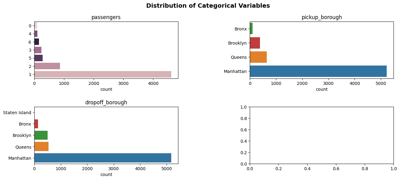
Wow - I think that’s our best plot yet! We see that increasing the width of our figure proportionally increases the width of our subplots.
super_title and super_title_fontsize
Although all of our subplots are automatically titled with the categorical feature that they correspond to, we can configure our so-called “super title”. The “super title” is the overall figure title and, by default, is set to “Distribution of Categorical Variables” (through the super_title parameter). We can also change the font size of this super title using the super_title_fontsize parameter which, by default, is set to 14 pts.
This title is accurate, but let’s change it up a bit and make it bigger so that it really stands out!
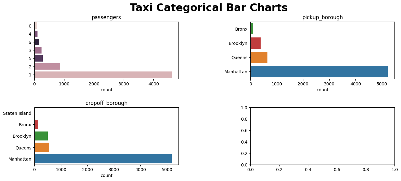
plot_categorical(taxi, categorical_feats, figsize=(15, 6), super_title="Taxi Categorical Bar Charts", super_title_fontsize=24)
Only displaying plots for categorical variables with 20 or less unique values.
Dropping the following variables for plotting: pickup_zone, dropoff_zone
(<Figure size 1500x600 with 4 Axes>,
 array([<Axes: title={'center': 'passengers'}, xlabel='count'>,
        <Axes: title={'center': 'pickup_borough'}, xlabel='count'>,
        <Axes: title={'center': 'dropoff_borough'}, xlabel='count'>,
        <Axes: >], dtype=object))
output
Now that we are happy with the configuration of our visualization, it’s tme to save our figure. As described with plot_binary, the output parameter is a boolean “flag” that indicates whether the figure is to be saved (rather than just returned as a matplotlib object). The default is False which indicates that the figure will not be saved. We can set this output parameter to be True to save the figure to the current working directory as categorical_variables.png.
plot_categorical(taxi, categorical_feats, figsize=(15, 6), super_title="Taxi Categorical Bar Charts", super_title_fontsize=24, output=True)
Only displaying plots for categorical variables with 20 or less unique values.
Dropping the following variables for plotting: pickup_zone, dropoff_zone
(<Figure size 1500x600 with 4 Axes>,
 array([<Axes: title={'center': 'passengers'}, xlabel='count'>,
        <Axes: title={'center': 'pickup_borough'}, xlabel='count'>,
        <Axes: title={'center': 'dropoff_borough'}, xlabel='count'>,
        <Axes: >], dtype=object))
If you run the code above, you should notice that a new categorical_variables.png file has been saved to your current working directory. Let’s remove this figure to clean up the process.
os.remove("categorical_variables.png")
Exploring Numeric Features
Now, let’s dive into the exciting world of exploring numeric features in your dataset using the versatile plot_numeric function. This handy function empowers you to visualize your numeric variables effortlessly, providing insights at a glance.
This versatile function simplifies the exploration process, requiring just a few essential inputs to generate insightful visualizations. plot_numeric, like the functions described above, takes in the dataframe containing your numeric variables and the specified list of numeric variables you wish to explore. However, plot_numeric has another essential input - plot type - that allows the user to choose the preferred plot type: ‘hist’ (Histogram), ‘kde’ (Kernel Density Estimate), or ‘hist+kde’ (Combined Histogram and KDE). With these fundamental inputs, you’re ready to embark on a visual journey, unraveling insights from your numeric data effortlessly!
To kick things off, let’s consider a real-life example with a dataset from the taxi domain. Our dataset boasts numeric features such as passengers, distance, fare, tip, tolls, and total. We’ll harness the power of plot_numeric to unleash the potential hidden in these numeric variables.
numeric_features = taxi.select_dtypes(include=['number']).columns.tolist()
numeric_features
['passengers', 'distance', 'fare', 'tip', 'tolls', 'total']
Histograms
If you’re eager to unravel the distribution patterns of your numeric variables, the hist plot type is your go-to. Let’s witness the magic:
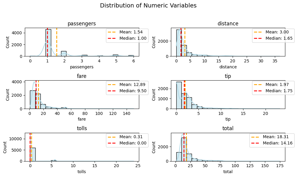
plot_numeric(taxi, numeric_features, 'hist')
(<Figure size 800x1000 with 6 Axes>,
 array([<Axes: title={'center': 'passengers'}, xlabel='passengers', ylabel='Count'>,
        <Axes: title={'center': 'distance'}, xlabel='distance', ylabel='Count'>,
        <Axes: title={'center': 'fare'}, xlabel='fare', ylabel='Count'>,
        <Axes: title={'center': 'tip'}, xlabel='tip', ylabel='Count'>,
        <Axes: title={'center': 'tolls'}, xlabel='tolls', ylabel='Count'>,
        <Axes: title={'center': 'total'}, xlabel='total', ylabel='Count'>],
       dtype=object))
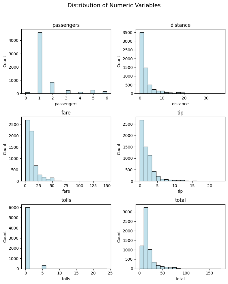
Ta-da! With just a simple call, you get a comprehensive visualization showcasing the distribution of your numeric variables.
Kernel Density Estimates (KDE)
For those who prefer a more nuanced view, the kde plot type is at your service. Watch as your numeric features come to life in a beautifully smooth representation:
plot_numeric(taxi, numeric_features, 'kde')
(<Figure size 800x1000 with 6 Axes>,
 array([<Axes: title={'center': 'passengers'}, xlabel='passengers', ylabel='Density'>,
        <Axes: title={'center': 'distance'}, xlabel='distance', ylabel='Density'>,
        <Axes: title={'center': 'fare'}, xlabel='fare', ylabel='Density'>,
        <Axes: title={'center': 'tip'}, xlabel='tip', ylabel='Density'>,
        <Axes: title={'center': 'tolls'}, xlabel='tolls', ylabel='Density'>,
        <Axes: title={'center': 'total'}, xlabel='total', ylabel='Density'>],
       dtype=object))
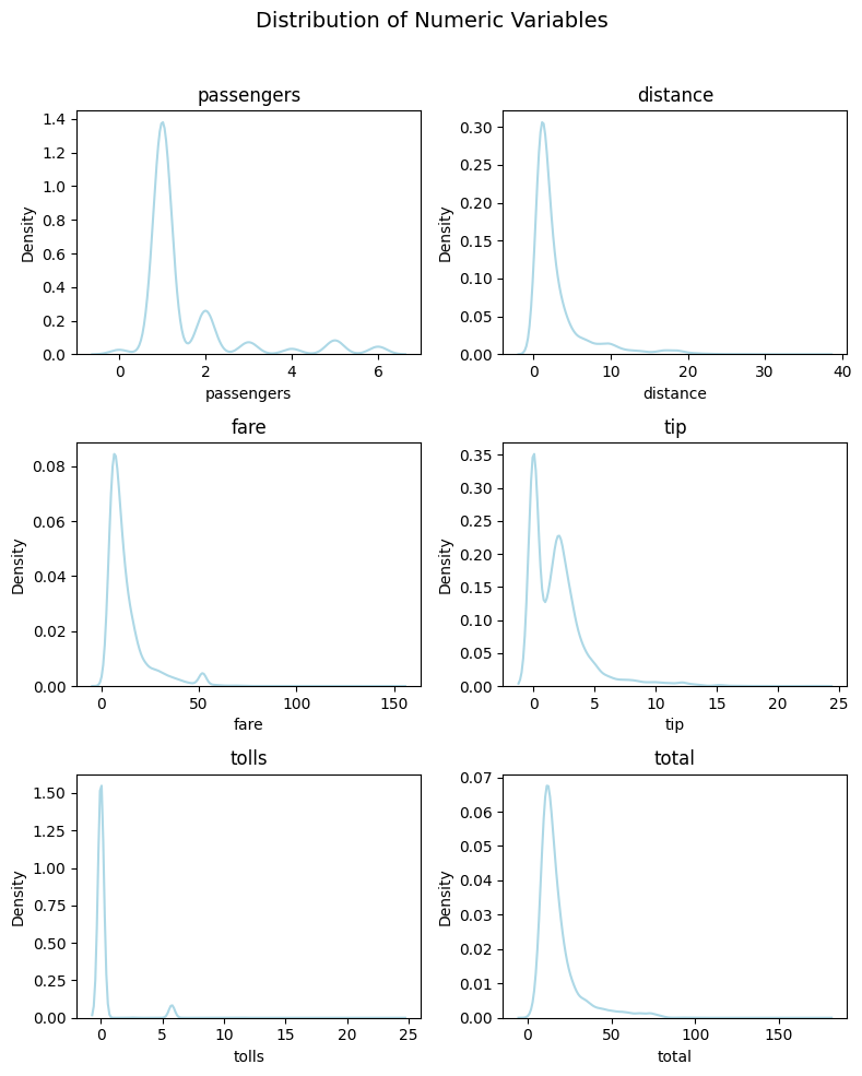
Wow! The Kernel Density Estimates provide a clear and elegant perspective on the underlying patterns in your numeric data.
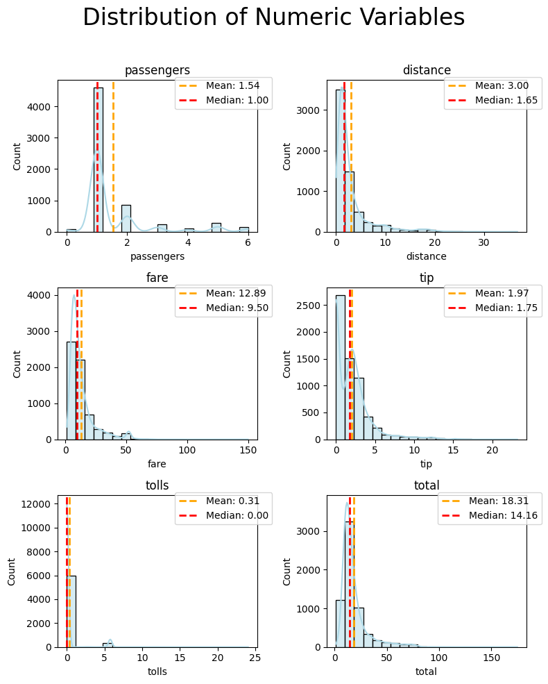
Histogram + KDE
Now, let’s take our exploration a step further. By setting the plot_kind parameter to ‘hist+kde’, you’ll unleash the combined power of histograms and kernel density estimates for a comprehensive understanding:
plot_numeric(taxi, numeric_features, 'hist+kde')
(<Figure size 800x1000 with 6 Axes>,
 array([<Axes: title={'center': 'passengers'}, xlabel='passengers', ylabel='Count'>,
        <Axes: title={'center': 'distance'}, xlabel='distance', ylabel='Count'>,
        <Axes: title={'center': 'fare'}, xlabel='fare', ylabel='Count'>,
        <Axes: title={'center': 'tip'}, xlabel='tip', ylabel='Count'>,
        <Axes: title={'center': 'tolls'}, xlabel='tolls', ylabel='Count'>,
        <Axes: title={'center': 'total'}, xlabel='total', ylabel='Count'>],
       dtype=object))
Marvel at the detailed insights into your numeric variables, where histograms and KDE seamlessly collaborate to tell a richer data story.
Optional Parameters
To embark on a more nuanced exploration of your numeric variables and tailor your plots according to specific preferences, delve into the realm of optional parameters. These parameters offer a customizable touch, allowing you to fine-tune your visualizations to align with your unique analytical needs.
figsize
When venturing into the realm of data visualization, the canvas size plays a crucial role in presenting your insights. The figsize parameter is your tool to shape the dimensions of this canvas. Like with the functions above, the figsize parameter configures the width and height of your plot, allowing you to control the spatial arrangement and clarity of visual elements. You can adjust figsize based on your preferences or specific requirements. Larger figures might be suitable for detailed exploration, while smaller ones could be more concise.
plot_numeric(taxi, numeric_features, 'hist+kde', figsize = (10, 6))
(<Figure size 1000x600 with 6 Axes>,
 array([<Axes: title={'center': 'passengers'}, xlabel='passengers', ylabel='Count'>,
        <Axes: title={'center': 'distance'}, xlabel='distance', ylabel='Count'>,
        <Axes: title={'center': 'fare'}, xlabel='fare', ylabel='Count'>,
        <Axes: title={'center': 'tip'}, xlabel='tip', ylabel='Count'>,
        <Axes: title={'center': 'tolls'}, xlabel='tolls', ylabel='Count'>,
        <Axes: title={'center': 'total'}, xlabel='total', ylabel='Count'>],
       dtype=object))
In this trial, a wider but slightly shorter canvas is employed comparing to default(which is (8, 10)), aiming to strike a balance between width and height. Tailoring figsize empowers you to fine-tune your visual narratives. Experiment and discover the canvas dimensions that best complement your data exploration goals.
output
In the realm of data visualization, sharing your discoveries can be just as important as making them. The output parameter in the plot_numeric function allows you to effortlessly save your visualizations to the current working directory.
Imagine you’ve uncovered intriguing insights through your numeric variable exploration using the plot_numeric function. Now, you want to capture and share these visualizations.
By default, the output parameter is set to False. In this case, your captivating visualizations won’t be saved automatically.
plot_numeric(taxi, numeric_features, 'hist+kde', output=True)
(<Figure size 800x1000 with 6 Axes>,
 array([<Axes: title={'center': 'passengers'}, xlabel='passengers', ylabel='Count'>,
        <Axes: title={'center': 'distance'}, xlabel='distance', ylabel='Count'>,
        <Axes: title={'center': 'fare'}, xlabel='fare', ylabel='Count'>,
        <Axes: title={'center': 'tip'}, xlabel='tip', ylabel='Count'>,
        <Axes: title={'center': 'tolls'}, xlabel='tolls', ylabel='Count'>,
        <Axes: title={'center': 'total'}, xlabel='total', ylabel='Count'>],
       dtype=object))
Setting output to True triggers the magic. Your visual masterpiece will be saved in the current working directory, allowing you to effortlessly share your findings.
If you run the code above, you should notice that a new numeric_variables.png file has been saved to your current working directory. Let’s remove this figure to clean up the process.
os.remove("numeric_variables.png")
Experiment with this parameter to seamlessly integrate visualization sharing into your data exploration workflow. Whether it’s for documentation, reports, or sharing insights with colleagues, the output parameter provides the flexibility you need.
super_title
In the journey of data exploration, sometimes a single overarching narrative can tie together the story told by multiple visualizations. The super_title parameter in the plot_numeric function allows you to infuse your entire plot with a captivating super title.
As you embark on visualizing the distribution of numeric variables in your dataset, imagine you want to give your entire exploration a unified identity. By default, the super_title is set to “Distribution of Numeric Variables.” This provides a generic but informative label for your exploration.
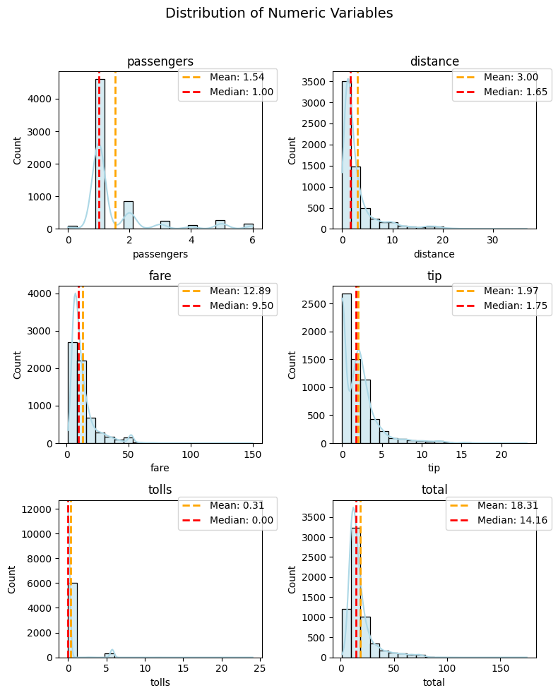
plot_numeric(taxi, numeric_features, 'hist+kde', super_title="You are the best!")
(<Figure size 800x1000 with 6 Axes>,
 array([<Axes: title={'center': 'passengers'}, xlabel='passengers', ylabel='Count'>,
        <Axes: title={'center': 'distance'}, xlabel='distance', ylabel='Count'>,
        <Axes: title={'center': 'fare'}, xlabel='fare', ylabel='Count'>,
        <Axes: title={'center': 'tip'}, xlabel='tip', ylabel='Count'>,
        <Axes: title={'center': 'tolls'}, xlabel='tolls', ylabel='Count'>,
        <Axes: title={'center': 'total'}, xlabel='total', ylabel='Count'>],
       dtype=object))
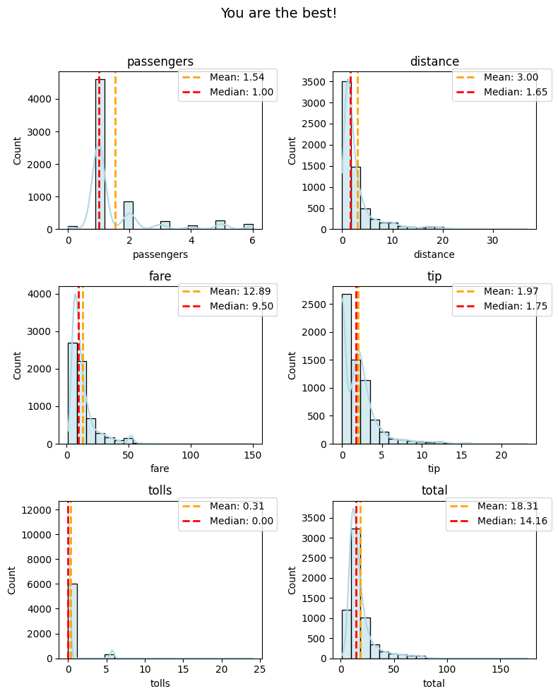
Injecting your creativity, you can set a custom super_title to give your entire plot a unique identity. In this example, “You are the best!” adds a touch of personalization to your exploration.
Experiment with different super titles to convey the essence of your data story. Whether it’s a summary of findings, a specific theme, or a question you’re exploring, the super_title parameter lets you add a meaningful layer to your visual narrative.
super_title_font
In the realm of data visualization, details matter, and the super_title_font parameter in the plot_numeric function allows you to precisely control the font size of your super title.
As you craft your visual exploration, imagine tailoring the font size of the super title to match the style and emphasis you desire.By default, the super_title_font is set to 14. This provides a balanced and readable font size for the super title.
plot_numeric(taxi, numeric_features, 'hist+kde', super_title_font=24)
(<Figure size 800x1000 with 6 Axes>,
 array([<Axes: title={'center': 'passengers'}, xlabel='passengers', ylabel='Count'>,
        <Axes: title={'center': 'distance'}, xlabel='distance', ylabel='Count'>,
        <Axes: title={'center': 'fare'}, xlabel='fare', ylabel='Count'>,
        <Axes: title={'center': 'tip'}, xlabel='tip', ylabel='Count'>,
        <Axes: title={'center': 'tolls'}, xlabel='tolls', ylabel='Count'>,
        <Axes: title={'center': 'total'}, xlabel='total', ylabel='Count'>],
       dtype=object))
If you wish to make a bolder statement or increase readability, you can customize the super_title_font. In this example, setting it to 24 enhances the prominence of your super title.
Experiment with different font sizes to find the right balance between subtlety and emphasis. The super_title_font parameter empowers you to fine-tune the visual aesthetics of your entire plot by adjusting the font size of the overarching title.
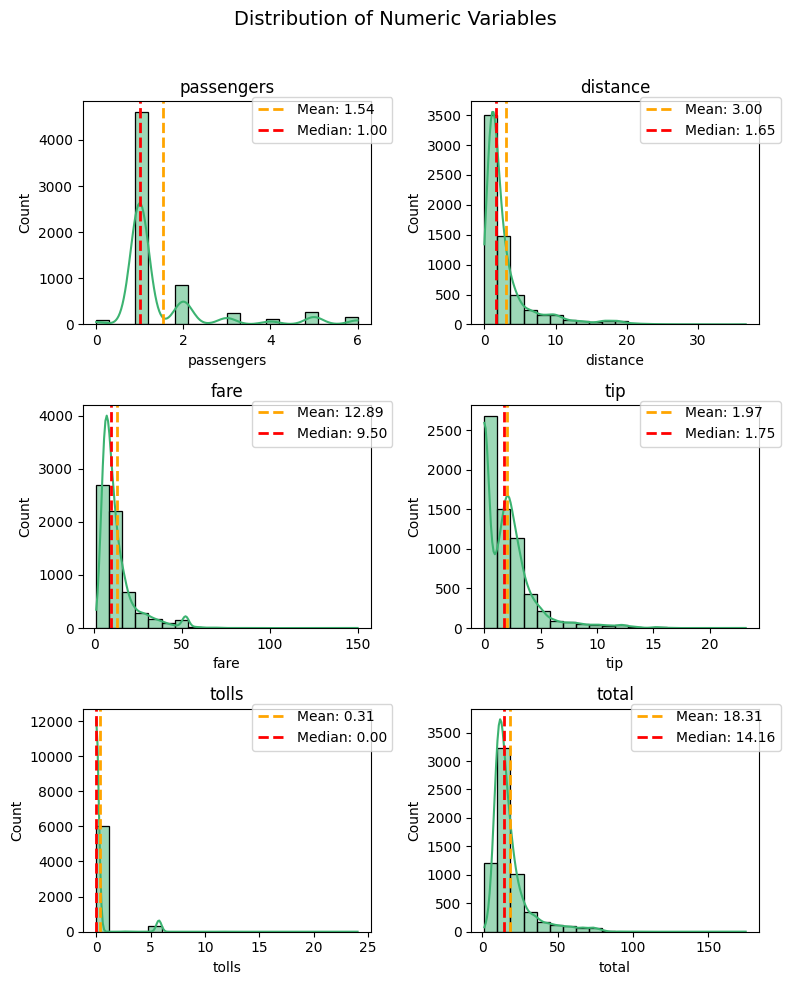
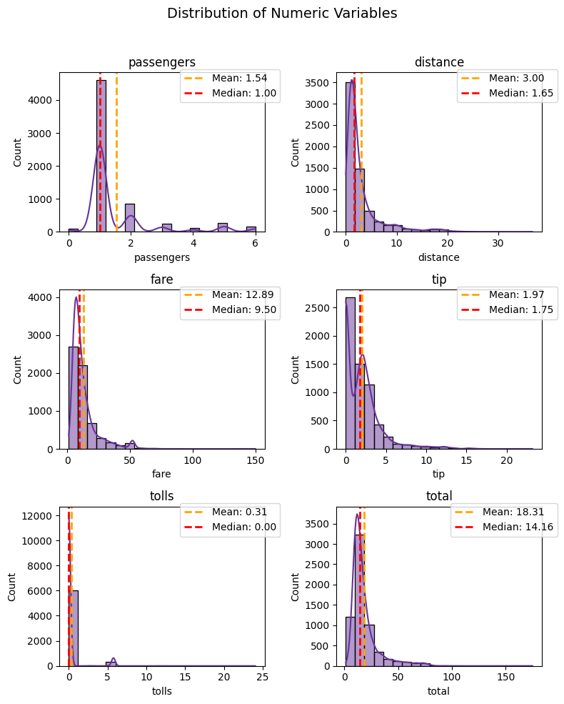
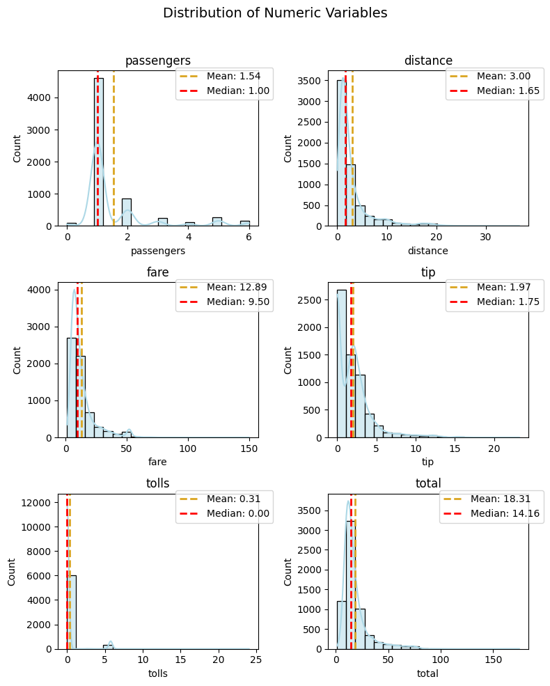
color
The `color`` parameter is your wand for painting the main elements of your plot. It sets the tone for the entire visualization, creating a captivating backdrop for your numeric narrative. Choose a color that resonates with the essence of your data, whether it be the soothing blue of the sky or the warmth of a golden sunrise.
plot_numeric(taxi, numeric_features, 'hist+kde', color='mediumseagreen')
(<Figure size 800x1000 with 6 Axes>,
 array([<Axes: title={'center': 'passengers'}, xlabel='passengers', ylabel='Count'>,
        <Axes: title={'center': 'distance'}, xlabel='distance', ylabel='Count'>,
        <Axes: title={'center': 'fare'}, xlabel='fare', ylabel='Count'>,
        <Axes: title={'center': 'tip'}, xlabel='tip', ylabel='Count'>,
        <Axes: title={'center': 'tolls'}, xlabel='tolls', ylabel='Count'>,
        <Axes: title={'center': 'total'}, xlabel='total', ylabel='Count'>],
       dtype=object))
plot_numeric(taxi, numeric_features, 'hist+kde', color='rebeccapurple')
(<Figure size 800x1000 with 6 Axes>,
 array([<Axes: title={'center': 'passengers'}, xlabel='passengers', ylabel='Count'>,
        <Axes: title={'center': 'distance'}, xlabel='distance', ylabel='Count'>,
        <Axes: title={'center': 'fare'}, xlabel='fare', ylabel='Count'>,
        <Axes: title={'center': 'tip'}, xlabel='tip', ylabel='Count'>,
        <Axes: title={'center': 'tolls'}, xlabel='tolls', ylabel='Count'>,
        <Axes: title={'center': 'total'}, xlabel='total', ylabel='Count'>],
       dtype=object))
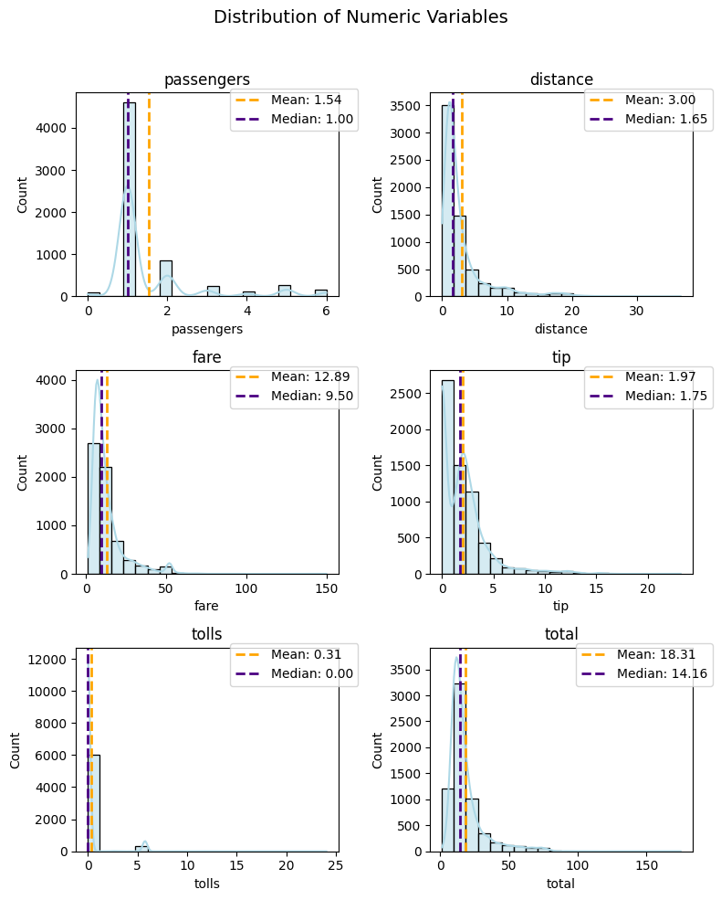
mean_color
Highlight the mean line with captivating colors that draw attention to the central tendency:
plot_numeric(taxi, numeric_features, 'hist+kde', mean_color='goldenrod')
(<Figure size 800x1000 with 6 Axes>,
 array([<Axes: title={'center': 'passengers'}, xlabel='passengers', ylabel='Count'>,
        <Axes: title={'center': 'distance'}, xlabel='distance', ylabel='Count'>,
        <Axes: title={'center': 'fare'}, xlabel='fare', ylabel='Count'>,
        <Axes: title={'center': 'tip'}, xlabel='tip', ylabel='Count'>,
        <Axes: title={'center': 'tolls'}, xlabel='tolls', ylabel='Count'>,
        <Axes: title={'center': 'total'}, xlabel='total', ylabel='Count'>],
       dtype=object))
median_color
Let the median line dance with flair by selecting colors that complement or contrast with the main plot:
plot_numeric(taxi, numeric_features, 'hist+kde', median_color='indigo')
(<Figure size 800x1000 with 6 Axes>,
 array([<Axes: title={'center': 'passengers'}, xlabel='passengers', ylabel='Count'>,
        <Axes: title={'center': 'distance'}, xlabel='distance', ylabel='Count'>,
        <Axes: title={'center': 'fare'}, xlabel='fare', ylabel='Count'>,
        <Axes: title={'center': 'tip'}, xlabel='tip', ylabel='Count'>,
        <Axes: title={'center': 'tolls'}, xlabel='tolls', ylabel='Count'>,
        <Axes: title={'center': 'total'}, xlabel='total', ylabel='Count'>],
       dtype=object))
Feel free to mix and match these colors, creating a visual masterpiece that resonates with the essence of your numeric data. Whether it’s the calming green of a meadow or the regal purple of twilight, let the colors in your plot speak volumes about the stories hidden within your numeric variables.
May your numeric exploration be as vibrant as the colors you choose!
Congratulations! You’ve successfully embarked on a journey of numeric exploration using the plot_numeric function. Whether you’re unraveling distributions with histograms, delving into subtleties with KDE, or combining both for a holistic view, this function is your reliable companion.
Exploring Time-series Features
In this final section, we’ll explore the use of the plot_time_series function from the PyXplor package.
This function is particularly useful for visualizing time-series data, providing insights into trends, seasonality,
and patterns over time. We’ll continue to use the Seaborn ‘taxis’ dataset as an example to demonstrate the capabilities of this function.
From the dataset info, we can see that pickup and dropoff are datetime fields, making them ideal for time-series analysis.
We’ll also explore numeric fields like fare, focusing on analyzing how the fare amount varies over time.
First let’s ensure pickup is a datetime type (even though we already know it is):
taxi['pickup'] = pd.to_datetime(taxi['pickup'])
Line Plots
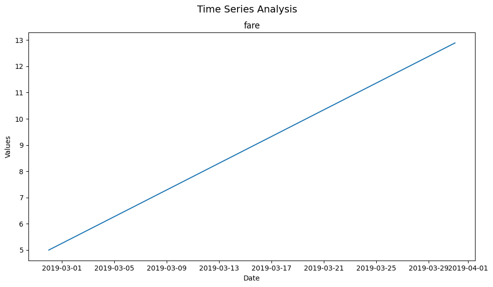
Let’s start with a simple example - feeding in our taxi dataframe, our time series column pickup, our “list” of numeric features to plot against time (in this case just fare), with a monthly frequency (M) - to plot fare over time on a monthly basis:
print("Basic Time Series Plot of Taxi Fares Over Time (Monthly):")
plot_time_series(taxi, 'pickup', ['fare'], freq='M')
Basic Time Series Plot of Taxi Fares Over Time (Monthly):
(<Figure size 1000x600 with 1 Axes>,
 array([[<Axes: title={'center': 'fare'}, xlabel='Date', ylabel='Values'>]],
       dtype=object))
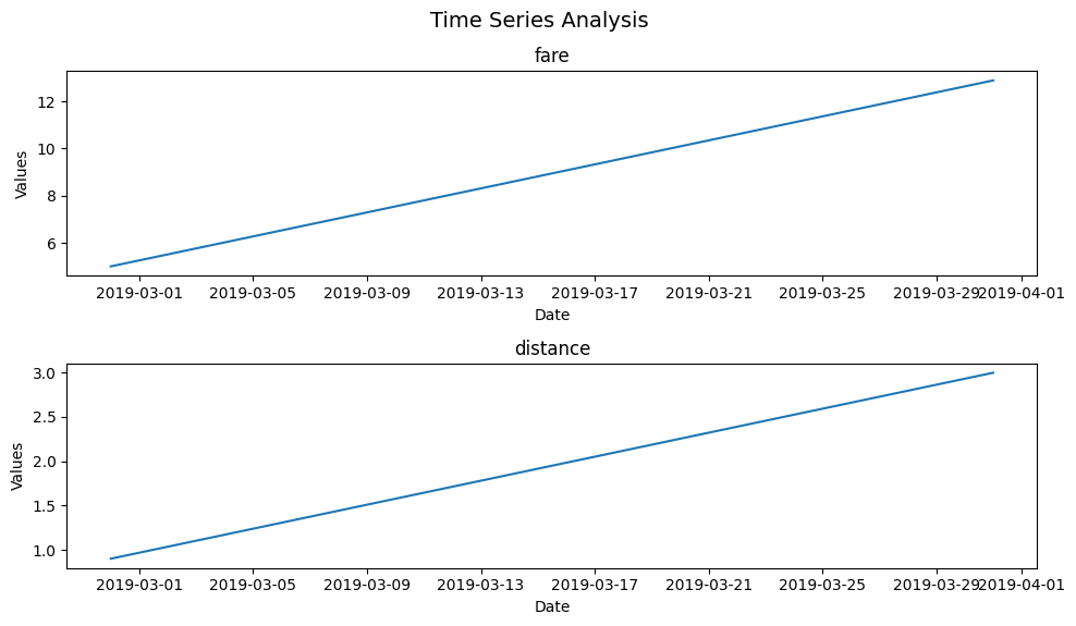
Given multiple numerical variables, plot_time_series, just like the other functions in the pyxplor package, can be used to visualize multiple time series with a single call of a function.
Here we can compare fare and distance over time.
plot_time_series(taxi, 'pickup', ['fare', 'distance'], freq='M')
(<Figure size 1000x600 with 2 Axes>,
 array([[<Axes: title={'center': 'fare'}, xlabel='Date', ylabel='Values'>],
        [<Axes: title={'center': 'distance'}, xlabel='Date', ylabel='Values'>]],
       dtype=object))
That’s all it takes to make plot_time_series work seamlessly! Now, let’s explore the optional arguments that add versatility to this function.
Optional Arguments
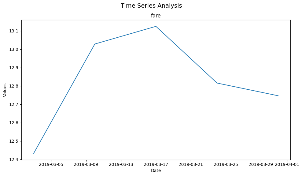
freq
Changing the frequency parameter (freq) can offer different insights. We can configure this frequency to be daily (‘D’), weekly (‘W’), monthly (‘M’) or yearly (‘Y’). Below, we plot the data on a weekly basis.
plot_time_series(taxi, 'pickup', ['fare'], freq='W')
(<Figure size 1000x600 with 1 Axes>,
 array([[<Axes: title={'center': 'fare'}, xlabel='Date', ylabel='Values'>]],
       dtype=object))
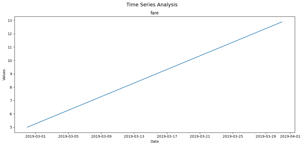
figsize
As with the other functioins in this package, figsize allows us to adjust the size of the figure. Here’s the same plot with a larger figure size to improve readability.
plot_time_series(taxi, 'pickup', ['fare'], freq='M', figsize=(12, 6))
(<Figure size 1200x600 with 1 Axes>,
 array([[<Axes: title={'center': 'fare'}, xlabel='Date', ylabel='Values'>]],
       dtype=object))
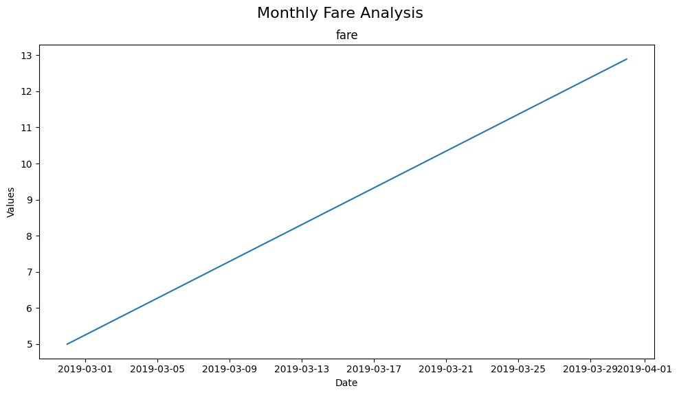
super_title and super_title_font
Customizing the super title and its font size can help contextualize the plot. Here’s an example with a custom title.
plot_time_series(taxi, 'pickup', ['fare'], freq='M', super_title='Monthly Fare Analysis', super_title_font=16)
(<Figure size 1000x600 with 1 Axes>,
 array([[<Axes: title={'center': 'fare'}, xlabel='Date', ylabel='Values'>]],
       dtype=object))
output
The output parameter allows saving the plot. Setting it to True will save the plot in the current directory.
plot_time_series(taxi, 'pickup', ['fare'], freq='M', output=True)
(<Figure size 1000x600 with 1 Axes>,
 array([[<Axes: title={'center': 'fare'}, xlabel='Date', ylabel='Values'>]],
       dtype=object))
We will, for the final time, remove the output image to clean up our folder.
os.remove("timeseries_variables.png")
In summary, the plot_time_series function from PyXplor offers a powerful yet easy-to-use tool for time-series analysis.
Its customization options allow for tailored visualizations suitable for a wide range of data exploration needs.
Conclusion
That completes the walk-through of the (current) plotting functions in the PyXplor package. We hope you see how using these specializied plotting functions can reduce the complexity and time invested in initial data analysis. We will continue to work on this package, introducing more flexibility in terms of configuring the appeareance of the plot - but let us know what you think!
Have fun and happy exploring!